The Concept of Pareto for Excel program |
Pareto for Excel™ is a fully functional program developed using Microsoft® Excel. This product is an integral part of the Microsoft® family of products and will allow you to import and export data, charts, and reports between all Microsoft® products.
The Pareto for Excel™ has many advanced features such as:
Generating Pareto diagrams by consolidating the results based on only:
- Cause
- Product
- Producer
Analyze data in multiple zones (do weekly analysis on daily data).
- Order of change analysis.
- Column or Bar Pareto diagrams.
- Analyze based on cost or defects.
- All parameters are customizable.
A Pareto diagram is used when one needs to analyze the
relative importance of data or variables. In
the late 1800’s, Vilfredo Pareto, an Italian economist, found that typically
80 percent of the wealth in a region was concentrated in less that 20 percent of
the population. Later, Hoseph Juran
formulated what he referred to as the “Pareto Principle”.
Pareto Principle: Only
a vital few elements (20 percent) account for the majority (80 percent) of the
problems. For example, only 20 percent of equipment problems usually account for
80 percent of our time.
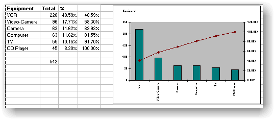
The Pareto diagram is a bar or column chart in which the data is arranged in the descending order or their importance. The diagram is really two charts in one. The Bar chart plots the descending data, the cumulative chart represents the percentage of each bar to the total.
