Case A - Pareto for Total
Step 1 - Start Pareto for Excel program (Start => Programs
=> Pareto for Excel => PFX106A.XLS)
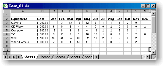
Step 2 - Collect the data and enter the data in Excel worksheet
Step 3 - Select the data with the first column being the CAUSE and
then the data
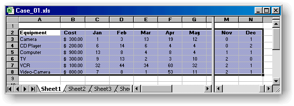
Note: Select two more column with blank data. The minimum
number of column needs to be 4.
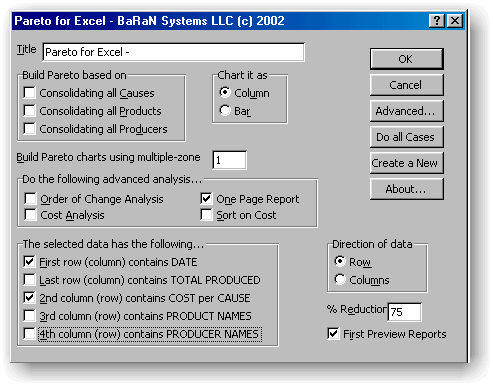
Step 4 - Choose the Pareto for Excel option from the Excel Tools
menu.
 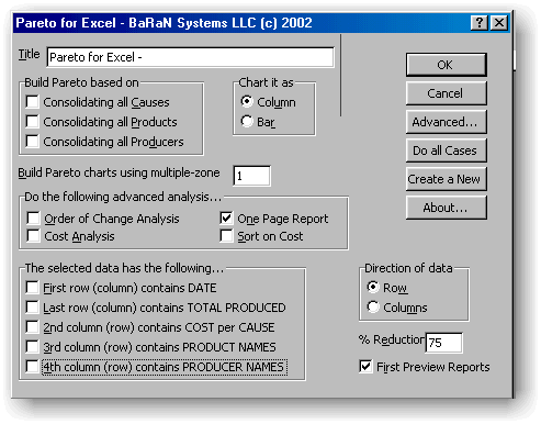
Step 5 - Make sure that you de-select all "Build Preto..."
and "The Selected Data.." options and then click OK.
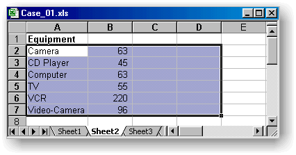
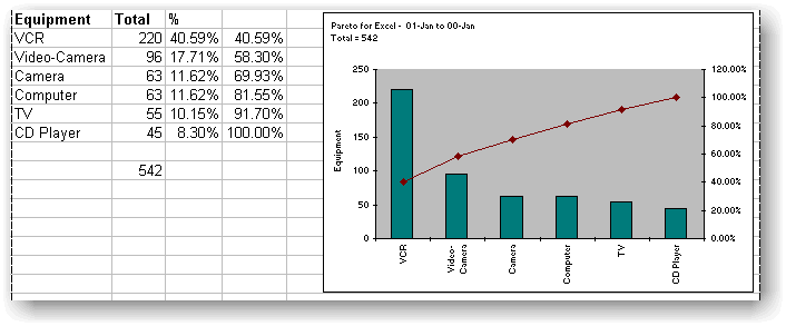
Step 6 - Review the results.
|